Monday, March 25, 2013

Tuesday, March 12, 2013

I found this awesome online photo store....
Photojojo! It has all sorts of fun things for photographers who like to think outside of the box and experiment with different ways to photograph. There are many things for your iPhone (though I do not like to consider iPhone pictures to be photography... there are still some pretty cool things!), they even have new polaroid film! Take a look
Thursday, February 21, 2013


Saturday, February 2, 2013

Monday, January 28, 2013
My Website
So in preparation for the thesis show I am posting my website so everyone can take a look.... not updated too recently, but I will be doing something very similar to these works. Hope you enjoy!
Jillian's Work
Jillian's Work
Saturday, December 8, 2012


Thursday, November 29, 2012
"Insectes" by Laurent Seroussi
I came across this stunning series a week or two ago.As I mentioned in my previous entry, I would like a way to combine my work with fashion. This seems to be Laurent Seroussi's take on that, and I really enjoyed seeing it. The lighting and execution of connecting the bug and woman is flawless. A person might think it is really a creature if they didn't know any better! 


Source: Hi-Fructose
Published Work for TRIM Magazine
This week has been pretty exciting... I mentioned previously that I did a shoot for Ancho Poncho. Last night it was published in TRIM magazine (a magazine put together by a some mason gross kids.) I also did another makeup shoot for them. I have discovered I definitely have an affinity for retouching (which is funny because it is the only thing in life i get OCD about/most people don't like using photoshop). Here is a link, and shots of my pages!Definitely different than my art, but I would really love to find a way to combine my art work with fashion.


Thursday, November 15, 2012
Zoe Leonard Exhibition
I had the change to visit the Zoe Leonard exhibition in Chelsea which spoke a lot to my work.
Upon entering the gallery there was a giant white room; on each
wall hung one or two faded looking photos. There was a giant white circle in
the middle and faded gray around it. The images were of the sun. They had a
thin almost black boarder surrounded by another two-inch boarder around the
entire thing.
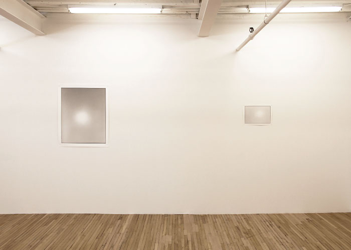
When
entering the second room, it was extremely dark and had a hole in the wall with
a lens in it. It was the camera obscura. We were encouraged to sit in the room
and as our eyes adjusted, we saw the images of the world surrounding the
building on the walls projected from the camera obscura. It created a very
relaxing and meditative environment; watching the movement from the outside
world in the dark room was very serene.

After
leaving this room and coming back into the first light room, the images on the
walls looked very different. They no longer looked washed out, but had much
more contrast in the tones that created them. Though the two rooms were very
different, yet they had a deeper connection than one might have originally
thought.

The
camera obscura has been seen many times before in different exhibitions and
throughout history in general, so some visitors might question why Leonard
decided to revisit it. Being prepared for this, she explains this answer in her
press release, stating that at this point in time, we all constantly seeing
images. She is asking questions about sight, and the camera obscura is a
different way of seeing an image- “it does not have to result in a fixed
image”. She continues on to explain that it creates a space and an experience; the
viewers are inside a camera.
The
press release definitely helps hold the exhibition together. Since it is such a
simple subject, the explanation really added dimension to the experience. I
really enjoyed reading her thoughts on the question of digital vs analogue. Her
response was “…I think the artist should choose whichever medium works best for
them.” This is a question I always debate (which I should be using), and it was
enlightening to read her thoughts, and how it lead her to create a camera
obscura. She also goes on to relate the camera obscura to the unconscious and
what happens inside of a person’s head. This is an interesting concept for me
to think about, since a lot of my pinholes are dream like.
Sunday, November 11, 2012
Ancho Poncho

 Today, I had the wonderful opportunity to meet and photograph the talented and beautiful gal behind Ancho Poncho, Annie. Annie is a prat student with many artistic accomplishments. Though she goes to school for illustration, what we were focused on during this shoot was her jewelry. She welds together unfinished metals to create beautiful, often geometric, earthy pieces. My favorite was gold cockroach earrings. Her paintings, prints and drawings were hung around the house, the girl is truly an artist.
 Will post some photos from the shoot as soon as I finish editing! (above found from internet)
Thursday, November 1, 2012
Stray Light Grey: Jonah Freeman & Justin Lowe (exhibition)
During a trip to Chelsea last week, we went the exhibition Stray Light Grey. These two artists did an incredible job forming a dream like, surreal journey for the viewers.


Thursday, October 25, 2012


Thursday, October 11, 2012
After Effects/Graphic Design
This is half of a graphic design project assigned. I don't usually discus graphic design being the other half of my concentration because I do not plan on pursuing it in the future (though the knowledge has come in very handy so far on my photography path!) But this is a project I am very proud of. I had a week to create an animation as well as teach myself after effects. The assignment was to "redesign" a book and make a video for it... I took it down bit of a different path but here it is!
Decolonization a Class Project by JC Lenochan
 |
| Picture taken from internet |
 |
| Picture taken from internet |
Thursday, October 4, 2012
I love this...
....Stan Brakhag film "Burial Path"
It's nostalgic, soft, and lacks sound allowing the viewer to use the soundtrack of their own thoughts and memories. The quickly changing movements feel like eyes flickering as they struggle to bring a clear memory to the surface.
With my own work, I'v been asked why I don't make films and why my images need to be still. This film really makes me think about it. The film stills would all be beautiful images on their own, but together as a film they feel so much more intimate. I want to make a film!
Wednesday, September 26, 2012
Photographer: Alison Scarpulla
 One of my favorite current photographers, who I discovered a few years ago in my internet travels, is Alison Scarpulla. Scarpulla's dark, surreal, world of strange figures and beautiful colors immediately drew me in. Every time I look through her work, I want to jump up and run into a forest with my camera. As a photographer myself, I sometimes have a hard time figuring out i she uses film or digital/ darkroom or photoshop. Maybe this is part of the magic of her incredible body of work.
 Link: http://shuttermade.com/alisonscarpulla


Wednesday, September 19, 2012
Fashion Week
Last week, I had the amazing opportunity to attend a few Fashion Week shows in Manhattan. Unfortunately, since I was a first-timer, I did not know what the protocol was on bringing a camera, and only was able to borrow an iPhone to take some quick shots at 2/4 of the shows I attended. (I'v been beating myself up for not bringing one!)
The first show I attended (camera less) was Rag and Bone. The fashion was overshadowed by my excitement; all I noticed were a few neon numbers and what the models look like in real life (skinny as expected!).
The second show (still camera less)I was more composed and able to look at the clothing. It was a men's designer N.Hoolywood. Being an artist, this was my favorite presentation. I saw it as more of an art piece than a runway show... The models stepped onto the "runway" (which was really a giant canvas) after stomping in black paint. Each model did this, and at the end of the show the designer ran out and signed his name across the bottom of the foot-printed canvas with spray paint.
The last two shows were Robert Geller and Tibi. Robert Geller had some pretty cool mens designs, and Tibi was pretty basic women but I enjoyed it anyway. (Sorry for the bad photo quality!)


The first show I attended (camera less) was Rag and Bone. The fashion was overshadowed by my excitement; all I noticed were a few neon numbers and what the models look like in real life (skinny as expected!).
The second show (still camera less)I was more composed and able to look at the clothing. It was a men's designer N.Hoolywood. Being an artist, this was my favorite presentation. I saw it as more of an art piece than a runway show... The models stepped onto the "runway" (which was really a giant canvas) after stomping in black paint. Each model did this, and at the end of the show the designer ran out and signed his name across the bottom of the foot-printed canvas with spray paint.
The last two shows were Robert Geller and Tibi. Robert Geller had some pretty cool mens designs, and Tibi was pretty basic women but I enjoyed it anyway. (Sorry for the bad photo quality!)

Robert Geller

Robert Geller

Robert Geller (That's his wife and little daughter in front!)

Tibi

Tibi
Subscribe to:
Posts (Atom)